Overview
Here, I am writing the introduction series on all Power BI visuals so that the end user or beginner will gain a basic idea of how visuals work. In this series, we will learn about each OOTB Power BI visuals step by step.
Before you start with this tutorial, I recommend you to go through my previous articles.
- Introduction to Power BI Visual Part 1
- Introduction to Power BI Visual Part 2
In this article, we will talk about the below two visuals provided by Power BI Desktop OOTB.
1. Clustered Bar Chart2. Clustered Column Chart
We can find this visual in OOTB Power BI. Please refer the below screenshot for it.
Let’s get started!
Clustered Bar Chart and Clustered Column Chart
The below screenshot shows clustered bar chart. This chart shows values (sum, count etc.) on X-axis and group by data on Y-axis.

The following screenshot shows the drilled down visual of Clustered Bar Chart.


Below screenshot shows the clustered column chart. This chart shows values (sum, count etc.) on Y-axis and group by data on X-axis.
The following screenshot shows the drilled down visual of Clustered Column Chart.

Now, let’s understand each term in detail.
We should set the following parameters to create a Clustered Bar Chart and Clustered Column Chart.
Ex: We will learn this chart using Sales data which has the following columns, and the data will look like this.


I want to prepare a chart for total sales done by a company by region and item. I need total sales by region and when I drilled down through the region, it will show me sales data by item.
So, let’s get started!
Here, these are the most important properties to create this chart.

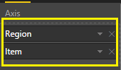
Axis
We want sales data by region, so I will drag the region first.
I want to drill down the data by item wise so, I will add Item to the axis field.
Values
Now, I want to show the number of items sold in each region.
So, I will add Units field in my values field.

After adding Axis and Values, my chart will look like this.


Legend
Legend field is also a very useful feature provided by Staked bar chart.
Suppose, sometimes we need to represent our bar in the different color with different categories.
Ex: I want my first level drill down categorized with item count.
So, I will select “Item” in Category field.
Here, we can see the difference between normal stacked bar or column chart and clustered bar or column chart.


Tooltip
When you need to achieve functionality on hover of bar chart, tooltip is very useful.
Ex: On hover of bar chart I want to show total and unit cost.
So, I will drag both the fields in my staked bar chart.
After setting all these above properties our chart will look like this.

Now, let’s talk about design elements
It provides the following functionality.
Please refer my previous article for design elements.
All design elements work the ame as mentioned in the previous article.

Conclusion
This is how we can set clustered bar chart and Clustered Column Chart in Power BI.
In next part, we will talk about 100% stacked bar chart and 100% stacked column chart in a deep manner.
Hope you love this article!
Comments
Post a Comment