Overview
I am writing an introductory series on all Power BI visuals for end-users or beginners to have a basic idea how visuals work. During this series of Power BI visuals, we will learn about each OOTB Power BI visual step by step.
In this article, we will talk about the following visual provided by Power BI Desktop OOTB.
Stacked Bar Chart
Stacked Bar Chart
Let’s get started!
Stacked bar chart looks like this. This chart shows values (sum, count etc.) on the X-axis and group by data on the Y-axis.

Now, let’s understand each term in detail. We should set the following parameters to create a Stacked Bar Chart.

Let us learn this chart using Sales data which has the following columns. The data will look like this.


I want to prepare a chart for total sales done by the company sorted by region and item. I need total sales within a region and when I drill down through the region, it should show me sales data by item.
So, let’s get started!
Here, these are the most important properties to create this chart.

Axis
We want sales data by region, so I will drag the region first. I want to drill down the data item-wise so, I will add Item in the Axis field.

Values
Now, I want to show number of items sold in each region. For this, let's add Units field in values field.

After adding Axis and Values, my chart will look like this.

Legend
The Legend field is also a useful feature provided by Stacked Bar Chart. Suppose, sometimes we need to represent our bar in different colors with different categories ( For example, I want my first level drill down categorized with item count). So, I will select “Item” in Category field.


Tooltip
When you need to achieve the functionality on hover of the bar chart, tooltip is very useful.

Ex: On hovering over the bar chart, I want to show total and unit cost.
So, I will drag both the fields in my Stacked Bar Chart. After setting all these above properties, our chart will look like the following.

Now, let’s talk about design elements
It provides the following functionality.

General
Here, we can set height, width, X and Y position, alternative text etc. Recently, it has got one preview feature, i.e., Responsiveness.

Legend
From here, you can change the legend settings, like its color, font, font size, position, and title.

Y-axis
From here, you can hide or show the Y-axis. Here, you can also change the position of Y-axis to left or right.
We can also make formatting changes from here.

X-Axis
From here, you can hide or show the X-axis. Here, in Scale type, we have two options -
- Linear
- Scaler
In Start and End tab, we can set the figure manually if we wish. By default, Power BI automatically detects a range.
We can hide or show the title using this setting. We can also hide, show, and format the Gridlines from here.

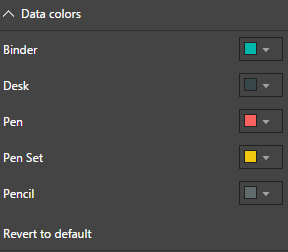
Data colors
Power BI automatically adds data colors when we are adding a visual. If we want to change the data colors, we can change those using this option.
Data labels
Here, if we want to set the labels on bar, we can Switch-On this feature. If we enable the data label, it provides various formatting options.

Plot Area
This setting has an option for transparency for background. We can set the background transparency from here.

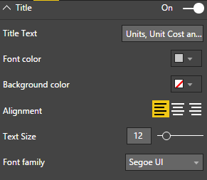
Title
Using this option, we can show or hide the Title. If we want to change or format a title, we can do that just in a few clicks.
Background
Using this option, we can set the background for our visual.
It provides two options.
- Background Color
- Transparency

Lock aspects
This feature is used to lock the proportion of the visual. If we resize the mouse, we will find our visual in the same proportion.

Border
As the name suggests, this option is used to apply border element around Power BI visual. We can also change the color property using this option.

Conclusion
This is how we can set Stacked Bar Chart in Power BI. In next part, we will talk about Stacked Column Chart in deep manner.
Hope, you loved this article!
Comments
Post a Comment